
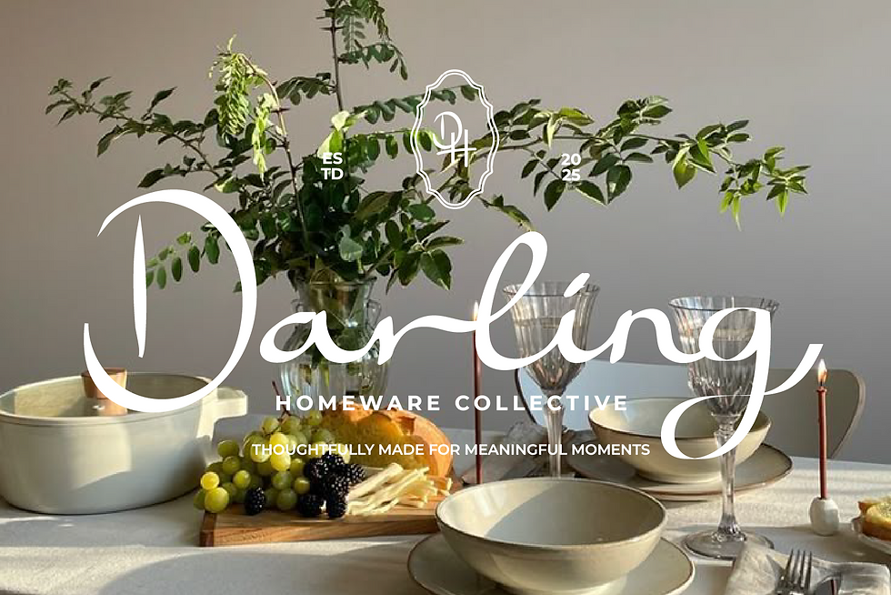
Darling Homeware Collective
The project focused on developing a cohesive brand identity and visual system for a contemporary South African lifestyle brand that celebrates thoughtful design and meaningful living. The goal was to create a brand that feels both refined and welcoming, balancing artisanal detail with modern simplicity.
The project explored how visual storytelling, adaptable design, and emotional branding could work together to position Darling as an accessible yet aspirational homeware brand.
Scope
• Brand Identity and Visual System Development
• Logo and Typography Design
• Brand Voice and Copywriting
• Collection Naming and Storytelling
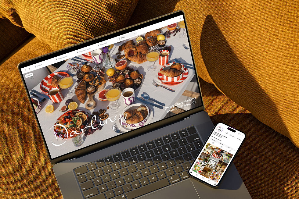
• Website and Digital Design Direction

The Brand
Darling is an elegant yet approachable homeware brand, distinct for its emotional resonance and timeless versatility. The adaptable design system enables cohesive expansion across collections, campaigns, and product categories without visual dissonance. Darling’s minimalist foundation enhances rather than competes with its product diversity, ensuring that each launch, from whimsical to classic, feels unmistakably “Darling.”


The Approach
The visual direction for Darling centres on a minimal, monochromatic brand identity designed to balance restraint with expressive flexibility. A black-and-white logo, refined sans-serif typography, and neutral palette establish a timeless foundation that allows seasonal collections to adopt their own colour stories and emotional tones. This system ensures cohesion while enabling creative evolution, mirroring the modular design logic of contemporary lifestyle brands such as Aesop and Muji.
The handwritten-style script logo conveys warmth and intimacy, evoking the sentiment of a personal note or cherished gift, while the supporting sans-serif typography provides clarity and professionalism. This balance between emotion and structure allows Darling to move seamlessly between storytelling and commerce — an essential quality for a design-led e-commerce brand. Each design choice was made to reinforce Darling’s emotional identity: one that values craftsmanship, adaptability, and connection.

End Result
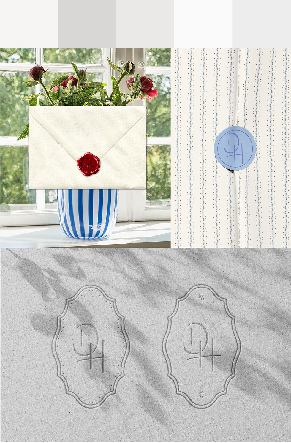
The resulting brand identity positions Darling as an elegant yet approachable homeware brand, distinct for its emotional resonance and timeless versatility. The adaptable design system enables cohesive expansion across collections, campaigns, and product categories without visual dissonance. Darling’s minimalist foundation enhances rather than competes with its product diversity, ensuring that each launch, from whimsical to classic, feels unmistakably “Darling.”
Through this approach, the brand strikes a balance between sophistication and accessibility, appealing to design-conscious consumers who seek meaning in everyday life. The outcome is a cohesive and enduring brand platform that celebrates thoughtful living

Ants Pizzeria
Brand Development, Crisis Communication and Social Listening
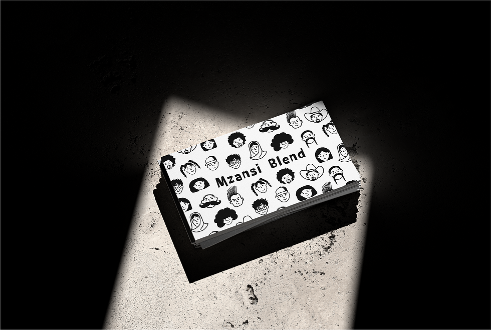
Mzansi Blend
Branding Design and Campaign Development



PORTFOLIO
LIKE WHAT YOU SEE?
GET IN TOUCH
