
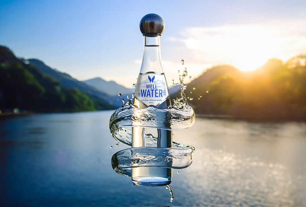
Well Water
Well Water is premium bottled spring water, sourced from an underground aquifer in the Rooiberge region of South Africa. The brand was tasked with scaling operations and increasing brand awareness and ROI through a comprehensive design and marketing initiative.
The project encompassed full brand development, including product design, visual identity, and a human-centred social media campaign aimed at generating engagement, shareability, and sales.
Scope
-
Brand Design & Identity
-
Product Design (Ergonomic Bottle)
-
Packaging Design
-
Copywriting & Messaging
-
Social Media Strategy & Content Creation
-
Campaign Concept Development
-
User-Generated Content (UGC) Integration


The Brand
Mission and Values
Well Water positions itself as a premium, inclusive, and human-centred lifestyle brand. Its mission is to provide hydration through thoughtfully designed products that combine functionality, accessibility, and aesthetics. Core values include inclusivity, wellness, sustainability, and design excellence.
Visual Identity
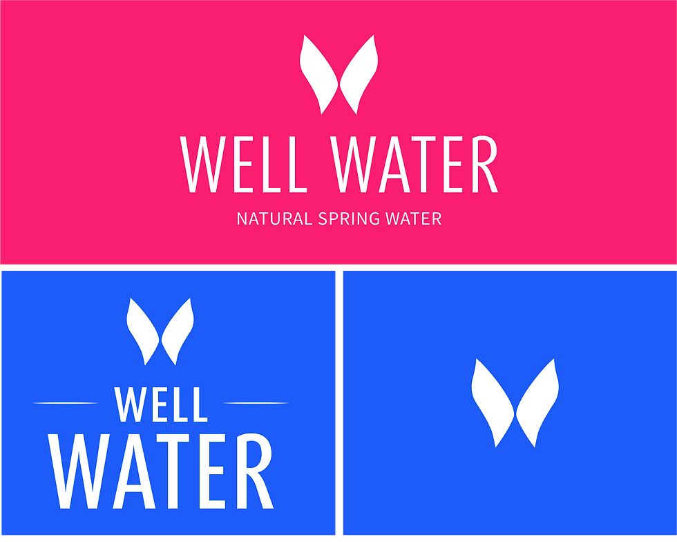
Well Water’s visual identity communicates purity, premium quality, and inclusivity. A clean and minimalist logo, tactile packaging textures, and a calming colour palette reinforce the lifestyle positioning. Messaging highlights wellness, empowerment, and everyday rituals of care. The aesthetic normalises accessibility, blending functionality and desirability, and positioning the product as a design object as much as a consumable.



Product Design
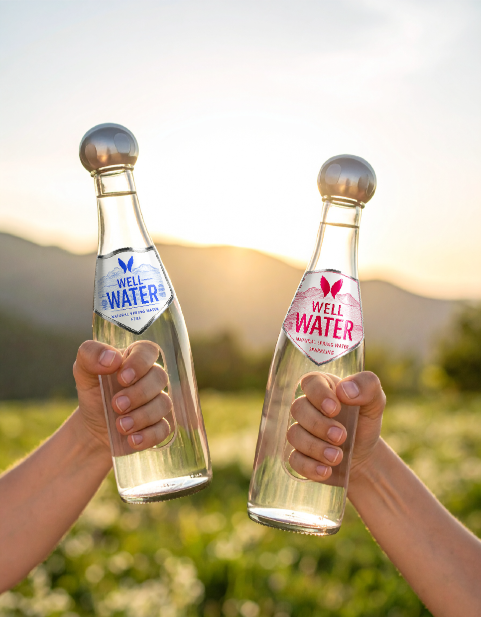
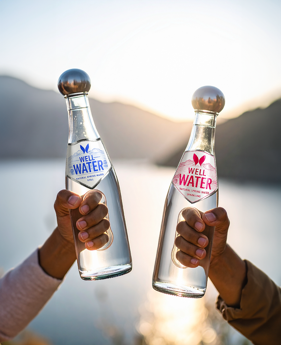
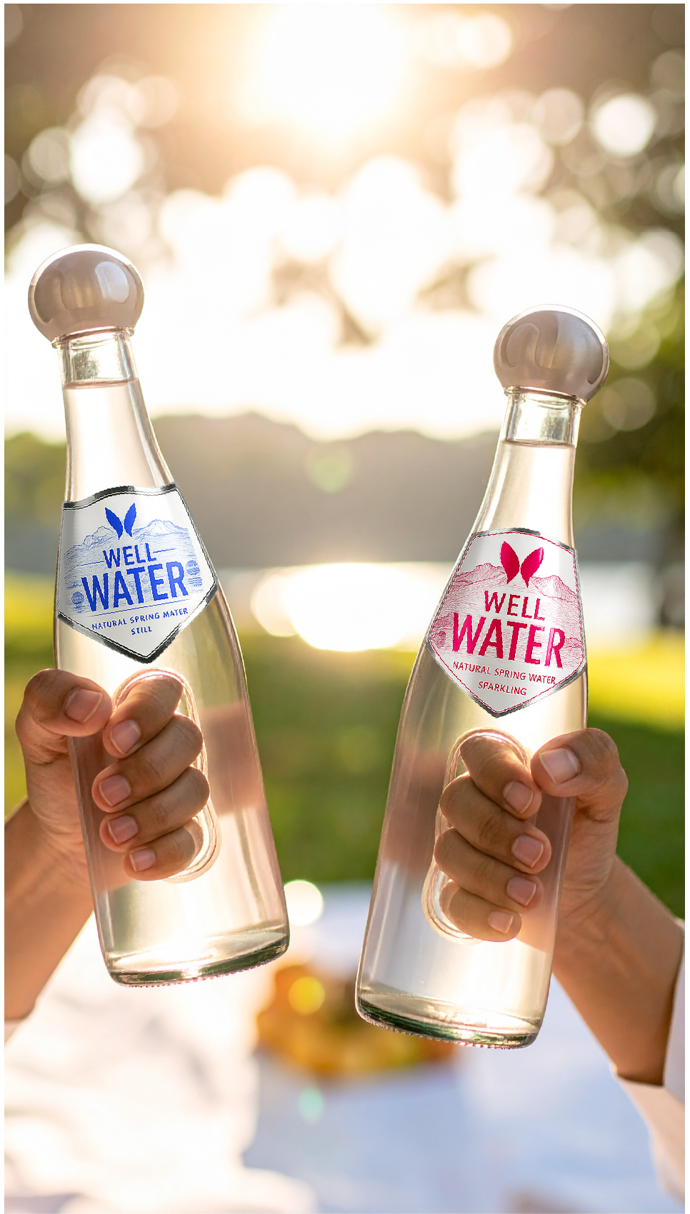
The bottle design is the central innovation. Ergonomic principles were applied to create a wider grip diameter, easy-to-grip lids, finger grooves, and contoured shapes to follow the hand’s natural curvature. These features make the bottle genuinely easier for individuals with arthritis or reduced hand mobility to hold and use, without overtly signalling it as a medical or assistive product. The form is sleek, minimalist, and visually appealing, ensuring broad consumer appeal.

Campaign Strategy
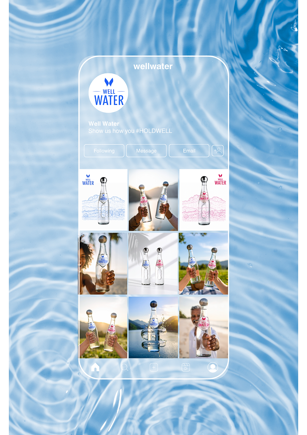
#HoldWell – Everyone Deserves to Hold Well
The campaign leverages a double entendre: “holding well” physically with the ergonomic bottle, and emotionally by embracing wellness, self-care, and empowerment. The initiative encourages user-generated content that showcases how individuals interact with the product, both practically and personally.
Human - Centred Storytelling
The campaign emphasises inclusivity and shared experience rather than segmentation by ability. Real-life narratives showcase diverse users interacting with the product. The ergonomic design is normalised through style and lifestyle context, empowering all consumers and reinforcing the human-centred approach.







End Result
Well Water emerged with a fully developed brand identity, an ergonomically inclusive bottle, and a dynamic social media campaign. The bottle design offers practical accessibility while remaining visually appealing to all users. The #HoldWell campaign drives engagement, fosters a sense of community, and encourages UGC that reinforces brand values. Instagram and TikTok provide platforms for storytelling, emotional connection, and organic reach. Collectively, the brand, product, and campaign establish Well Water as a lifestyle-driven, human-centred, and socially conscious brand that blends function, design, and cultural relevance.
Yummi
Brand Development and Promotional Strategy

Darling Collective
Entrepreneurship and Buisness Development



PORTFOLIO
LIKE WHAT YOU SEE?
GET IN TOUCH
